The brief & my role
I joined a small team with the primary objective of providing efficient support for the development of a new brand for Evri, while also ensuring its seamless implementation across the organization's digital platforms. Although there was limited room for UX improvements, my responsibilities encompassed various aspects of product design. This included working on the website and parts of the mobile application, as well as making significant contributions to the design system and documentation. Initially, when our team formed, there were certain aspects that required clarification and definition. However, there were also specific requirements that had already been established and were non-negotiable:
- Our mandate was to redesign all user interfaces (UI) within the given deadline. However, the focus was primarily on the visual aspects of the design, while leaving the majority of user experience (UX) considerations out of scope. This meant that we had to primarily focus on the look and feel of the interfaces rather than making significant changes to the overall user flow or interaction design.
- We were working with a fixed and non-negotiable deadline, which meant that regardless of the progress or potential impacts from other teams, we had to complete the project within a specific timeframe.
- We were required to work around the existing structure, including the current page formation, typography, and content hierarchy. This constraint posed a challenge as we had to ensure that the new design seamlessly integrated with the existing framework while still achieving the desired visual improvements.
- In addition to delivering a fully designed and extensive minimum viable product (MVP) for the digital platforms, our end result also needed to incorporate a comprehensive and foolproof design system. This design system would serve as a unified guide for future design and development efforts, ensuring consistency and efficiency. Additionally, thorough documentation was necessary to provide clear instructions and guidelines for implementing the new design across the organisation.
Initial challenges a brand appropriate for digital
While the primary brand redesign was being handled by an external agency, our design team remained actively involved in the process from the beginning, attending progress reviews. As a team, we took responsibility for advocating digital requirements, ensuring their inclusion as a default consideration, and negotiating the necessary flexibility for digital to propose and implement any required adjustments that were initially overlooked.
Some examples of design decisions addressed through this collaborative process:
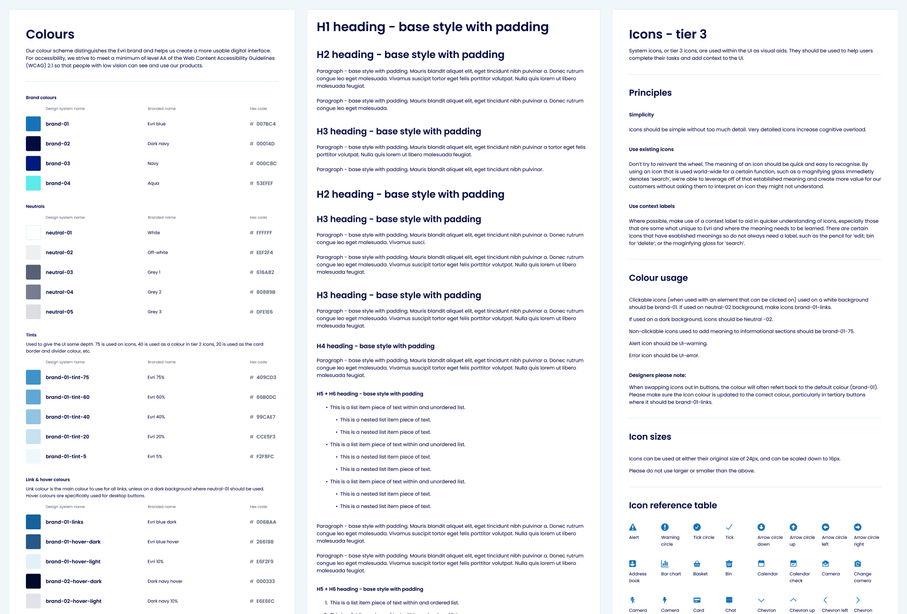
- Expanded & Accessible Colour Palette: We championed an expanded colour palette, incorporating a range of tints and shades. This decision catered to the diverse needs of UI utility and design hierarchy, granting us more flexibility in visually representing the brand across digital platforms. It was also necessary to negotiate small adjustments to specific colours for digital, to make sure the brand colour combinations would meet acceptable contrast ratios.
- Iconography Style: We pushed for the addition of an iconography style that effectively supported the UI elements. We considered factors such as clarity, consistency, and compatibility with the overall brand identity.
- Typographic Hierarchy: The necessity of a robust typographic hierarchy tailored specifically to digital platforms. We needed to go beyond the requirements for print and develop a hierarchy that supported the information architecture already in place, optimising legibility, usability and SEO.
- Balancing Illustrative and Photographic Features: As a team, we actively negotiated and struck the right balance between illustrative and photographic elements within the brand's digital presence. This balance ensured that the visual representation effectively conveyed the desired brand attributes while maintaining consistency and coherence.
Defining the look and feel
Once the external branding process reached completion and we thoroughly comprehended our working framework, we initiated the task of defining the aesthetics for our digital platforms. This undertaking commenced with a conceptual phase wherein I, in collaboration with a fellow designer, generated a number of diverse design concepts that all complied with the brand guidelines. In unison, we amalgamated the most effective components of these proposals into a conclusive direction, subsequently refining it through successive iterations.
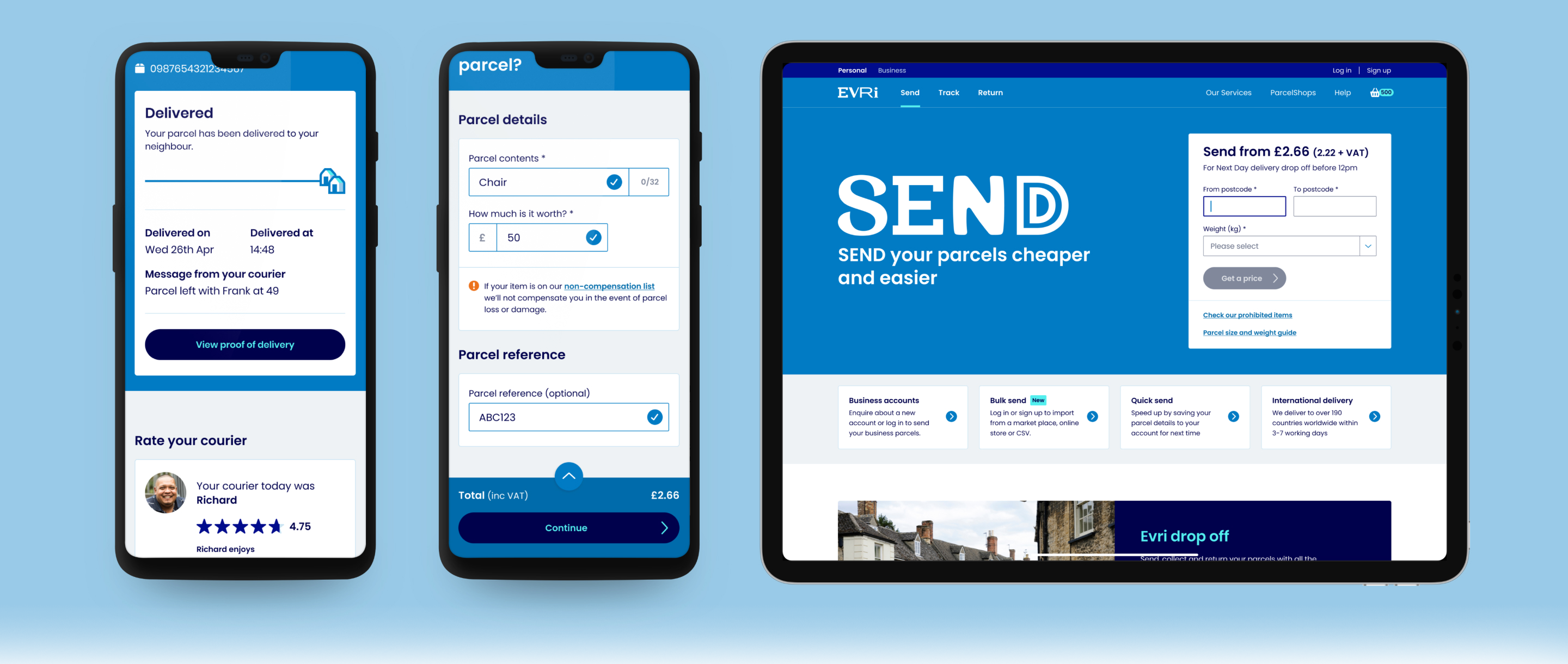
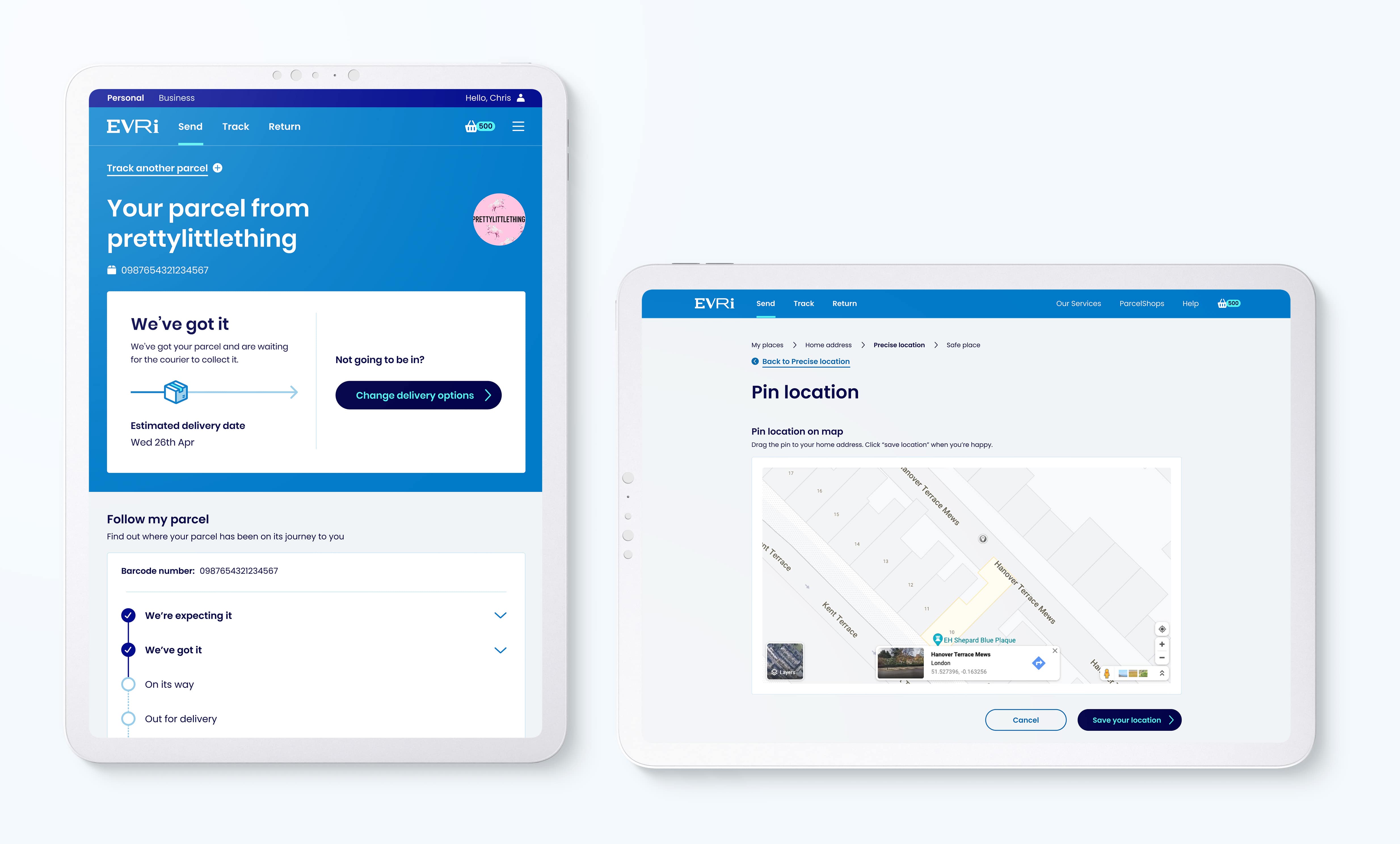
These introductory concepts were then used to inform the designs of select pages within the 'Send' journey, chosen as our initial focus due to its high usage and complex nature. It encompasses a large range of UI elements requiring design, making it a fitting starting point.
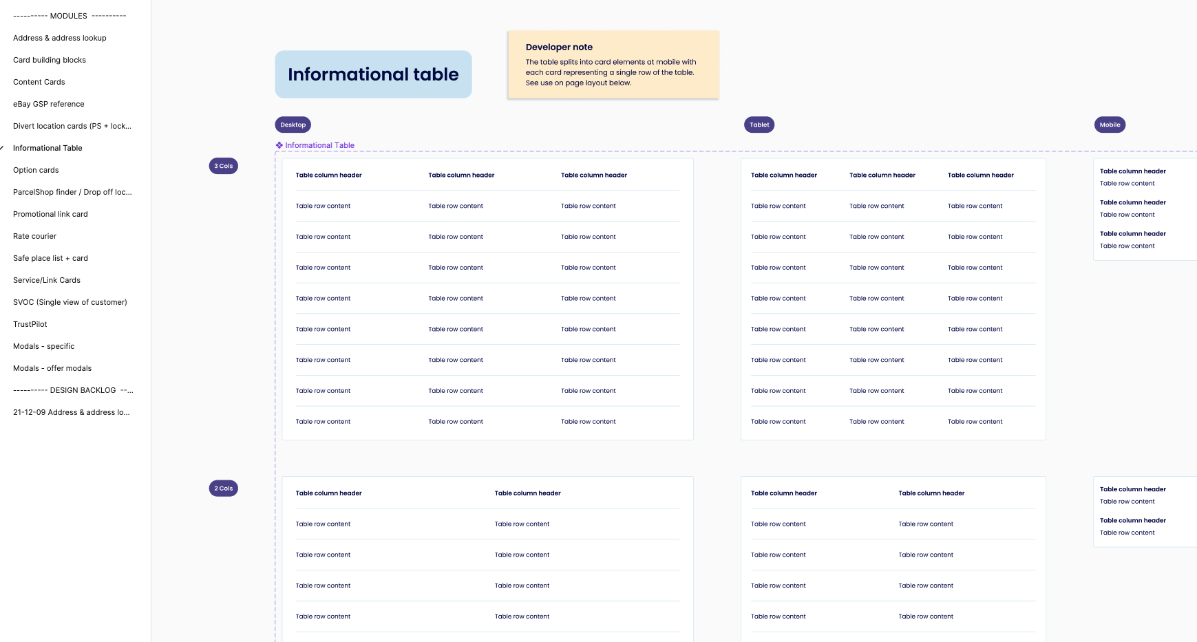
There were, after this point, still a few tweaks and changes, but getting here meant that we were able to start the design system in earnest. This involved delineating initial components, documenting colour application, establishing the principal typographic styles, and devising basic iconography. We also defined various styles like hero areas for the pages, navigation, card designs, the grid system, and the margin spacing we would employ throughout. Outlines, form fields, and other elements were also determined, thereby laying a solid foundation for what would be an extensive design process moving forward.
Library creation Styles, components & modules
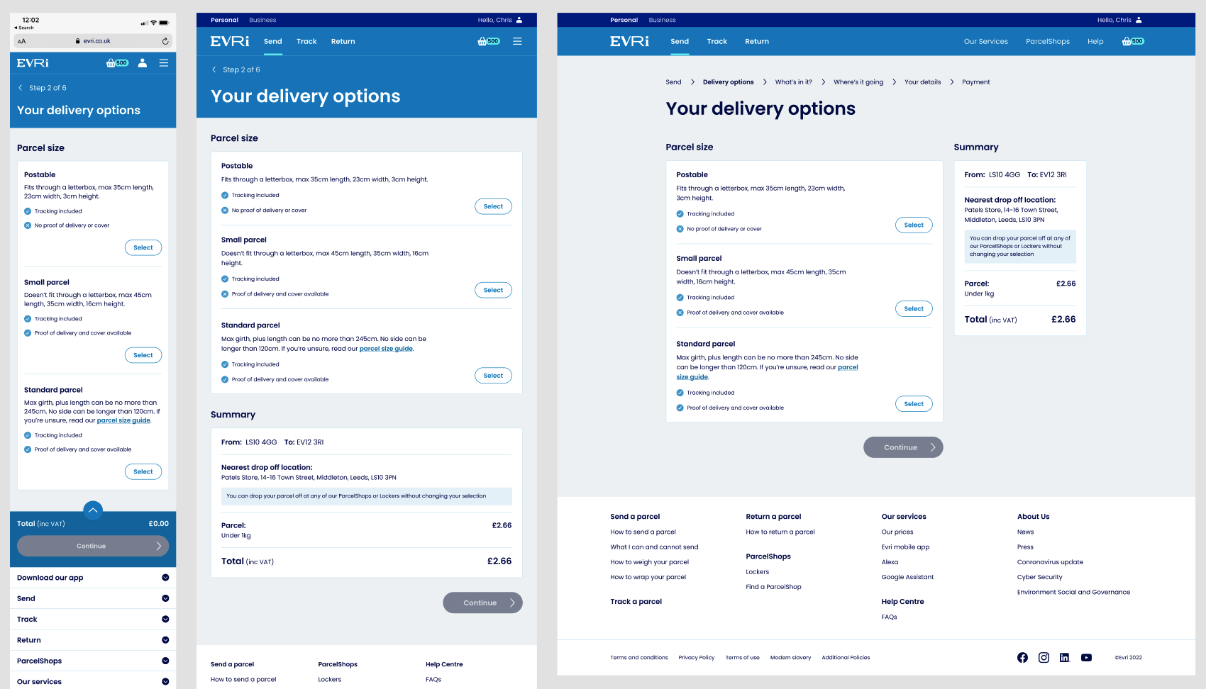
The subsequent phase, which comprised the majority of the project, was a strategic distribution of tasks. Alongside another designer, we divided the different journeys among ourselves and gradually navigated the considerable breadth of the Minimum Viable Product (MVP). We also delved into elements of the mobile app and Point of Sale (POS) machine journeys. This involved employing predefined components and modules that we had already designed, fine-tuning them as we unearthed new use cases and, in most instances, designing and developing fresh components and modules to add to our library. To ensure comprehensive coverage, we maintained a master list of prospective modules spanning all journeys, and where they would be used, which served as a valuable reference throughout the project.
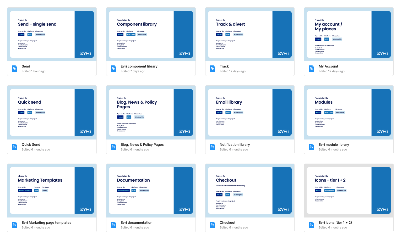
There were several factors to consider in structuring the library for our project. Given the substantial size of the task, we segmented it into multiple library files, ultimately forming four primary categories: Components, Modules, Documentation, and Iconography.
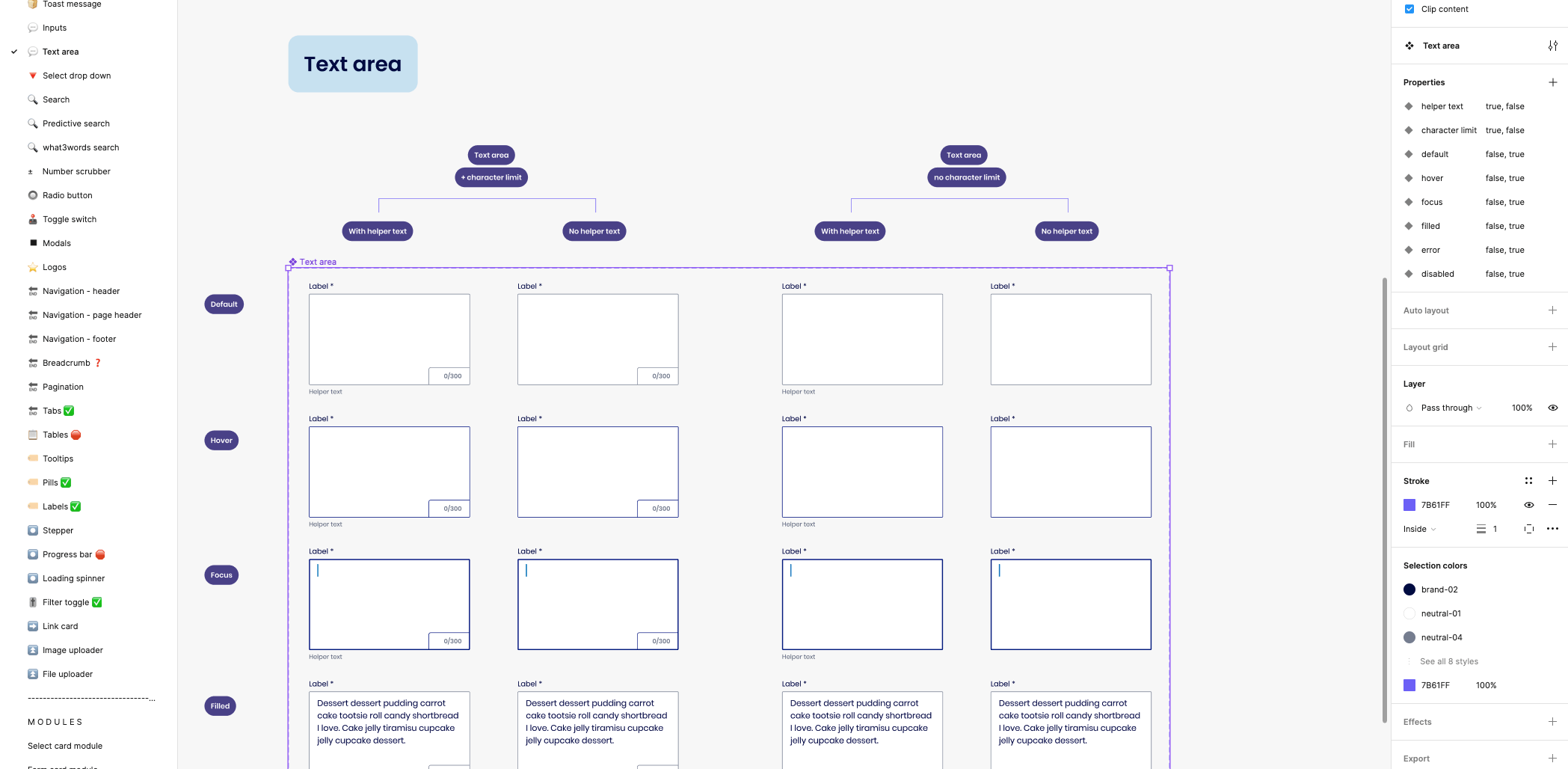
Additionally, for each 'section,' we created two separate files: a working file for our design process and an exported file intended for developer handover. By transforming screen layouts into components, any updates made in the working file would automatically replicate in the developer file. This method not only streamlined our workflow but also minimized traffic in the working files, thereby reducing the risk of unintended modifications.
Foolproof documentation
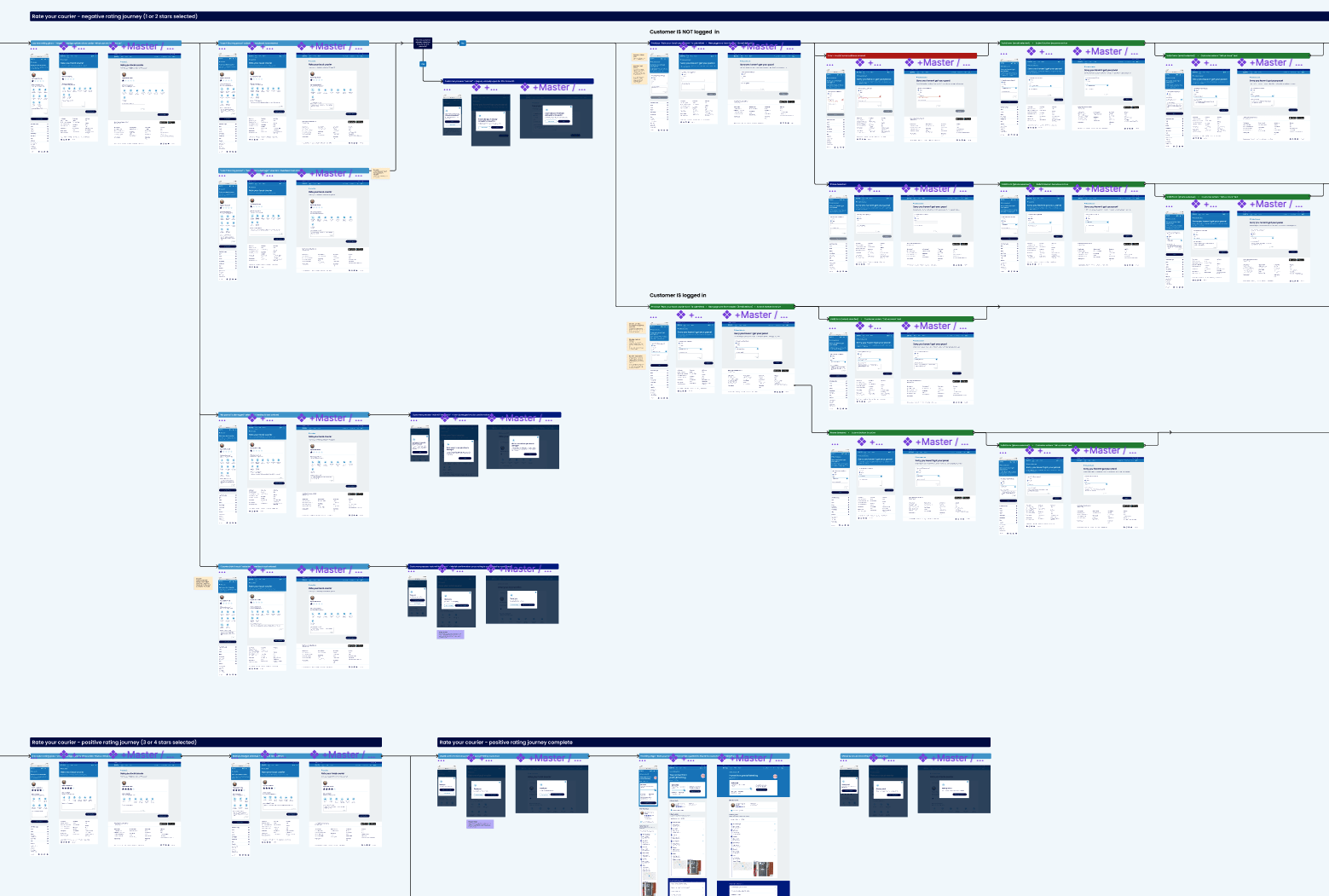
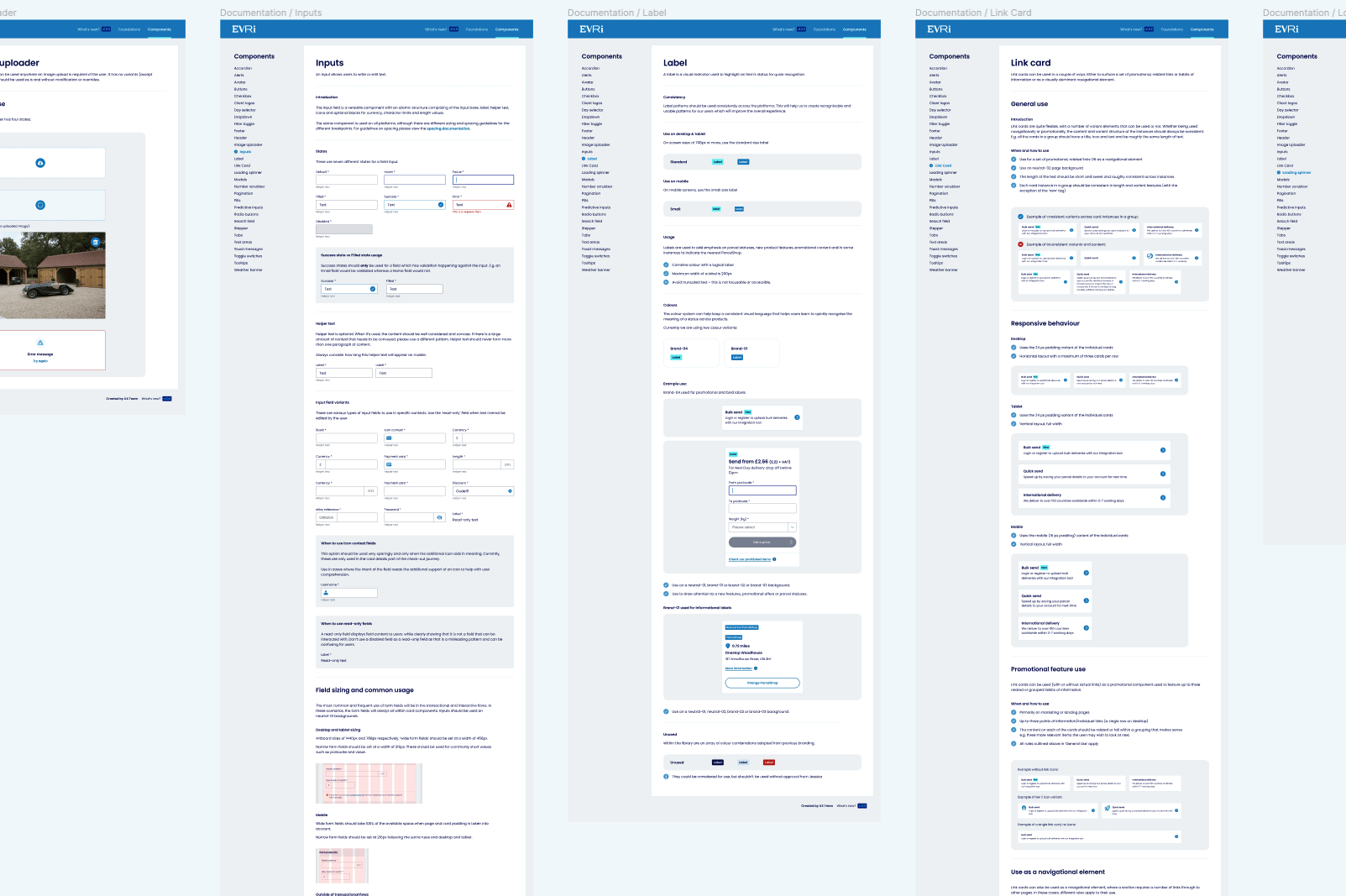
To ensure consistency and facilitate seamless onboarding for designers working on Evri's digital suite, we created a finalised documentation as an interactive prototype. This comprehensive documentation covered every style decision, along with detailed usage guidelines for every component and module.
The interactive prototype served as a valuable resource that allows designers to easily access and understand the design system. It provides a centralised repository of information, eliminating any ambiguity or guesswork when it comes to implementing the brand's visual elements. By encompassing all the necessary information in a structured and easily accessible format, the documentation enables designers to work efficiently and effectively, without the risk of inconsistencies.
Within the documentation, each style decision, such as colour application, typographic styles, and iconography was documented and presented with clear explanations and visual examples. New designers can easily navigate through the documentation to find the specific information they need for their tasks, promoting efficiency and reducing the potential for errors. Essentially making designing for Evri foolproof.
Moreover, the documentation also includes detailed guidelines on the usage of each component and module within the design system. This ensures that designers understand the intended purpose and proper implementation of each element. It prevents misuse or misinterpretation of components, leading to a consistent and harmonious user interface across the digital suite.
By providing a comprehensive and user-friendly documentation, we empowered designers to work autonomously while upholding the brand's visual identity and standards. The documentation acts as a valuable tool for maintaining consistency, facilitating collaboration, and streamlining the design process. It became an indispensable resource that supports the correct use of the design system and played a vital role in ensuring a unified and polished digital experience for Evri's users.
In the future
The restriction of focusing primarily on UI without significant changes to UX meant we uncovered several UX issues that had to be deferred to the backlog. While some small issues could be addressed, the larger problems had to be noted for future iterations. This inefficiency was a result of the non-negotiable deadline. In an ideal world, it would be beneficial to have more flexibility to address both UI and UX concerns simultaneously to avoid duplicating efforts and reiterating the design process. It is also a personally a little bit painful to gloss over glaring UX problems and not be able to fix them.
Building a design system for a large-scale project like Evri revealed the importance of iterative refinement. As new use cases and requirements emerged during the project, it became clear that continuous evaluation and refinement of the design system were necessary. This lesson highlights the need for ongoing collaboration and adaptation to ensure that the design system remains effective and adaptable as the project evolves.
The project provided valuable insights into the dos and don'ts of large-scale design systems. However, it is crucial to recognise that approaches and technology are constantly evolving. It is essential to stay updated with the latest industry trends, emerging tools, and design practices to leverage new opportunities and continually improve the process.
Effective collaboration and communication among team members and stakeholders are essential for the success of a project. Clear and frequent communication channels should be established to ensure that all team members are aligned, informed, and empowered to make necessary decisions. This project was actually an example of this culture implemented well, fostering a collaborative environment and open lines of communication throughout the project lifecycle. Ultimately resulting in a successfully delivered project.
worked with,
- Warner Music Group
- EMI
- Sony Music
- Co-Operative Music
- Razor & Tie
- Red Eye Transit
- The Revival Tour
- Nonesuch Records
- SideOneDummy
- BringTheNoise
- Transgressive Records
- Universal Music Group
- Ed Banger Records
- Joan Jett
- Shadowrun Online
- EA Games
- The Sims 3
- EA Sports Active
- Portal 2
- Call of Duty
- Mass Effect
- Dead Space
- Warpball
- ghd
- Original Source
- Charles Worthington
- Imperial Leather
- Eastpak
- Volcom
- Cinespia
- Silicon Valley Rocks
- Moxy
- Seabrooke
- Vodafone UK
- Vodafone Group
- Vodafone Enterprise
- Nectar Card (Aimia)
- The BHF
- Qdooz
- Thames Water
- Lloyd’s Register
- TalkTalk
- Co-Operative
- Natwest
- BAE Systems
- Miley Cyrus
- Chuck Ragan
- Cheryl Cole
- La Roux
- Calvin Harris
- Pixie Lott
- Hungry & Woods
- Kate Nash
- Noah & The Whale
- Katherine Jenkins
- Jay Z
- Janet Jackson
- Nonpoint
- Conjure
- Grundfos
- Surgease Ltd
- Evri (Hermes)
- Paulo Nutini
- Animal Kingdom
- Alphabeat
- The Veronicas
- Viva (MTV)
- Artic Monkeys
- Chapel Club
- Chase & Status
- Madonna
- Sophie Ellis-Bextor
- Austin Wilde
- The Saturdays
- Two Door Cinema Club
- Take That
- Vertigo Records
- Snow Patrol
- Chuck Ragan
- Nissan
- Laithwaites Wine